Before diving into typography, let’s discuss first what makes up a bad habit. Here’s my take:
- Not able to use the right tools for the right job — bad.
- Not able to apply design fundamentals — bad.
Have you been naughty? Let’s find out.
1. Center-aligning paragraphs of text
Are you still insisting that trending websites use this style? Trends or not, you must understand the fundamentals of typography.

“With center alignment, your users work harder to find where each line begins to continue reading. Without a straight left edge, there is no consistent place where users can move their eyes to when they complete each line.”
- Why You Should Never Align Center Paragraphs of Text
Use left aligned text because center align is tough to read.
2. Too much or too little leading
You are taking “read between the lines” to a new level. Using too little or too much leading is tough to read.

Use 120–145% of font size. I prefer 150%.
3. Eye-popping ALL CAPS
Title case is how you design bold statements. Are you having anger management issues? USING ALL CAPS LOOKS LIKE YOU ARE SHOUTING AT YOUR AUDIENCE. Using all caps in a paragraph is tough to read.

“ In emails, using all caps is a sign of bad manners. In design, using all caps is a sign of bad readability. ”
Use sentence case on your paragraphs.
4. Hyphenate default “on”
You are not bothered by hyphens. Using too many hyphens disrupts the flow of texts.

Turn off Hyphenate and let Photoshop do the rest.
5. Manually adding line breaks
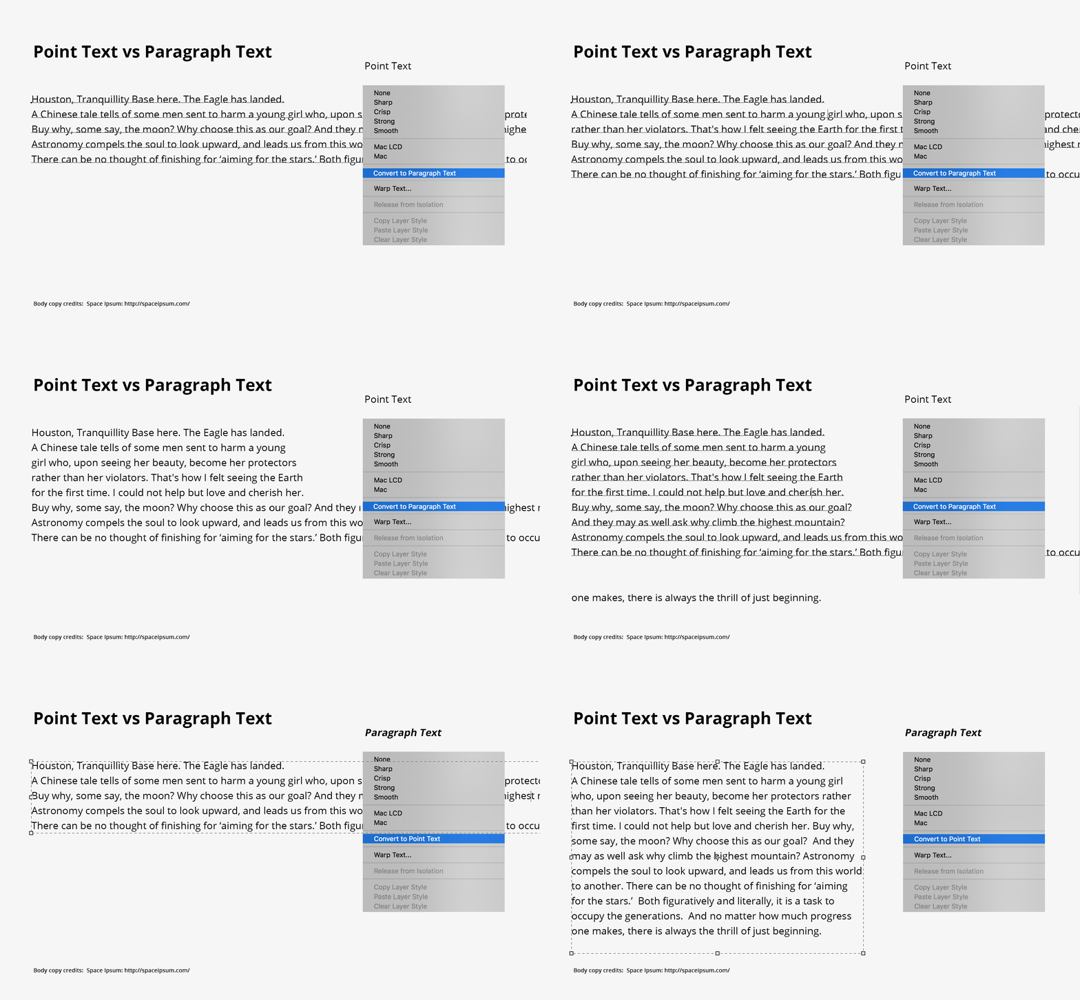
Do you start creating paragraphs using Point text form in Photoshop?This creates a kilometric horizontal line of text. Urgh. After which you begin breaking the lines manually. Double Urgh. #Nosebleed.

Make it a habit to use Paragraph Text. Do not manually line break your paragraphs. Use Paragraph Text and let Photoshop wrap your sections automatically.
6. Unjustly justification
Do you think justified text-align makes your layout look neater? A consequence of using block-justified texts is creating gaping chasms or rivers of white between words.

“Those “jagged” text block edges that text-justifiers are trying to get rid of actually make the text easier to read. Besides the obvious reason that big gaps between words interrupt the reading flow, there’s a less obvious reason. While the reader’s eye is scanning each line, it’s easier for her to find the next line if the lines are of uneven length.” — Justify text with HTML/CSS? Don’t do it!
Avoid justifying text. Readability is the priority.
7. Blocks of Text
Do you layout blocks of text like icebergs? Break up overwhelming large blocks of text to make it easier for users to digest the information.

Use around five lines as a maximum.
8. Line Length
You create paragraphs of text that spans the entire width of your canvas. Don’t. Keep line lengths below 80 characters wide. The longer it stretches, the harder it is for users to read.

A good range of line length is between 45–75 characters — 66 including spaces.
9. Characters used as icons
You still use characters such as V, < or > to make arrows. Gone are the days that we can only rely on > and < or HTML codes. Have you heard of Font Awesome?

Avoid using characters, use scalable vector icons.
10. Text Alignment
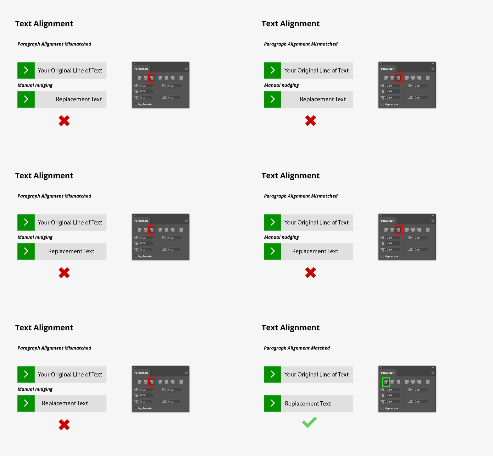
Manually nudging your layers to get the right alignment? #StillNoseBleeding

Match your paragraph alignment to that of your design–if you decide to change the text, it will still look correct, and you don’t have to keep on nudging to get the right alignment.
I had fun creating this list. Special shoutout to Meet the ipsums for providing all the wordy samples in this post.
If you need a refresher on typography, read this article from Creative Market.
If you want to typeset like a boss, hear it straight from Robert Bringhurst and his acclaimed “Typographer’s Bible” book, The Elements of Typographic Style.
